Design notes · ELEVOR
One page, a clear hierarchy
Decide what someone should notice first.
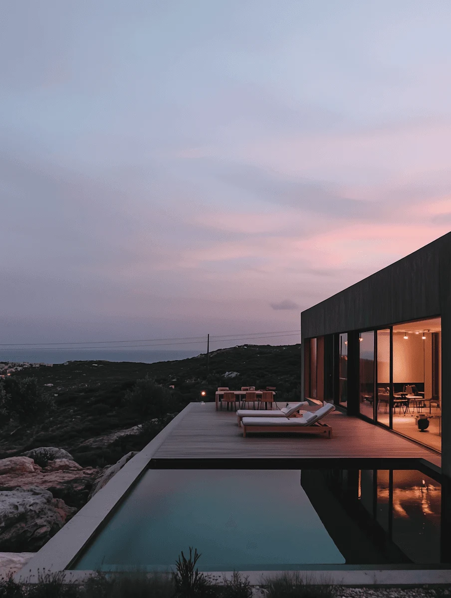
The photograph introduces the residence. The name anchors it. The details help someone decide where to look next. Putting all three at the same visual weight makes the page harder to read.
Here, scale and spacing do most of the work. The citron accent is reserved for important actions, while the surrounding warm neutrals let the photography stand out.